VA Toolshelf | Software Hub for Creator Tools, PlayStation

Project Summary: Led the redesign of the VA Toolshelf, a centralized creator tools platform used across PlayStation Visual Arts, transforming it from a system of control into a system of support. Through deep design-engineering collaboration, simplified complex workflows, improved accessibility, and increased adoption from 60% to 90% within a live production studio.

My Role: Product & UX Strategy / Experience Architecture (IA) / Interaction & Visual Design / Prototyping & Validation / Accessibility Advocacy / Leadership

Collaborators

Collaborators

Lead Software Engineer

Target Audience

Target Audience

PSVA Departments: Production, Mocap, Animation, Rigging, Sound, Art and Engineering

Platform

Platform

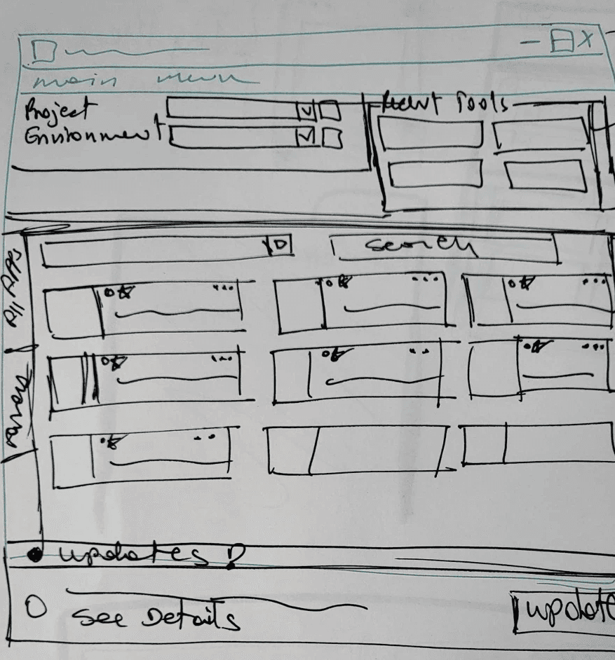
Native Desktop Tool / App for PC, MAC, and Linux

Stakeholders

PSVA Director of Engineering, PSVA Director of R&D, PSVA Director of Animation, Lead Software Engineer

PSVA Director of Engineering,
PSVA Director of R&D,
PSVA Director of Animation,
Lead Software Engineer

Duration

Duration

5 Months

Challenge

Despite being a mission-critical studio platform, VA Toolshelf was difficult to navigate and inefficient for launching software, leading users to bypass the system entirely. This breakdown in adoption created downstream pipeline fragmentation, licensing compliance risks, and gaps in studio-wide visibility, undermining both creative flow and operational integrity of the studio.

Business Goals


  • Increase adoption of VA Toolshelf as the primary tool-launch platform

  • Streamline tool discovery to support creative flow and production efficiency

  • Reduce licensing and pipeline risk by consolidating tool access and usage tracking


    Impact Metrics below:
    Based on comparative usability testing, stakeholder analytics review, tool reporting, and user satisfaction surveys.

100%

Ease of Use

90%

Intuitive - Finding & launching Tools

80%

Fail - Duplicating Tools Feature


The Project

Context & Organizational Importance:
The VA Toolshelf is a centralized software hub used by every artist and game developer at PlayStation Visual Arts. It functions as the studio’s operating system, where teams access tools, manage updates, and prepare for production work. Any friction in this platform directly impacts creative velocity, data integrity, and overall studio efficiency.

Your Role & Radical Collaboration:
As the sole Senior UX Designer, I owned product strategy and experience design, working side-by-side with the Lead Software Engineer in an agile environment. My role extended beyond interface design, I acted as a translator between design, engineering, and production teams, ensuring solutions were technically feasible, production-safe, and inclusive of diverse creator workflows.

This close partnership enabled rapid iteration, early validation, and trust across studio-wide disciplines.

Problem Framing:
Despite its importance, the VA Toolshelf was failing to support its users:

  • Outdated UI created high cognitive load

  • Cluttered navigation slowed production through excessive scrolling

  • Poor accessibility (8pt fonts) made scanning difficult in multi-monitor setups

Adoption dropped to 60%, with teams bypassing the platform entirely, creating gaps in studio-wide data, efficiency, and trust.

Strategy Insight:
Through research and interviews, a critical insight emerged:
The problem wasn’t just usability, it was emotional.

The update system visually “punished” users by turning the interface bright red if they hadn’t updated, creating frustration and embarrassment. The platform had become a system of control, not support.


This insight reframed the strategy:
We weren’t just redesigning a tool, we were repairing a broken relationship between creators and the system they relied on.
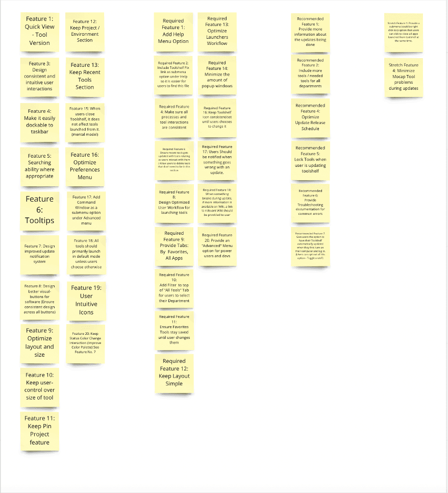

Key Solutions:

Empowered Discovery

  • Department filters, favorites, and search to let users curate their workspace

Autonomy Over Control

  • User-controlled update scheduling with guardrails, balancing tech artist needs and production deadlines

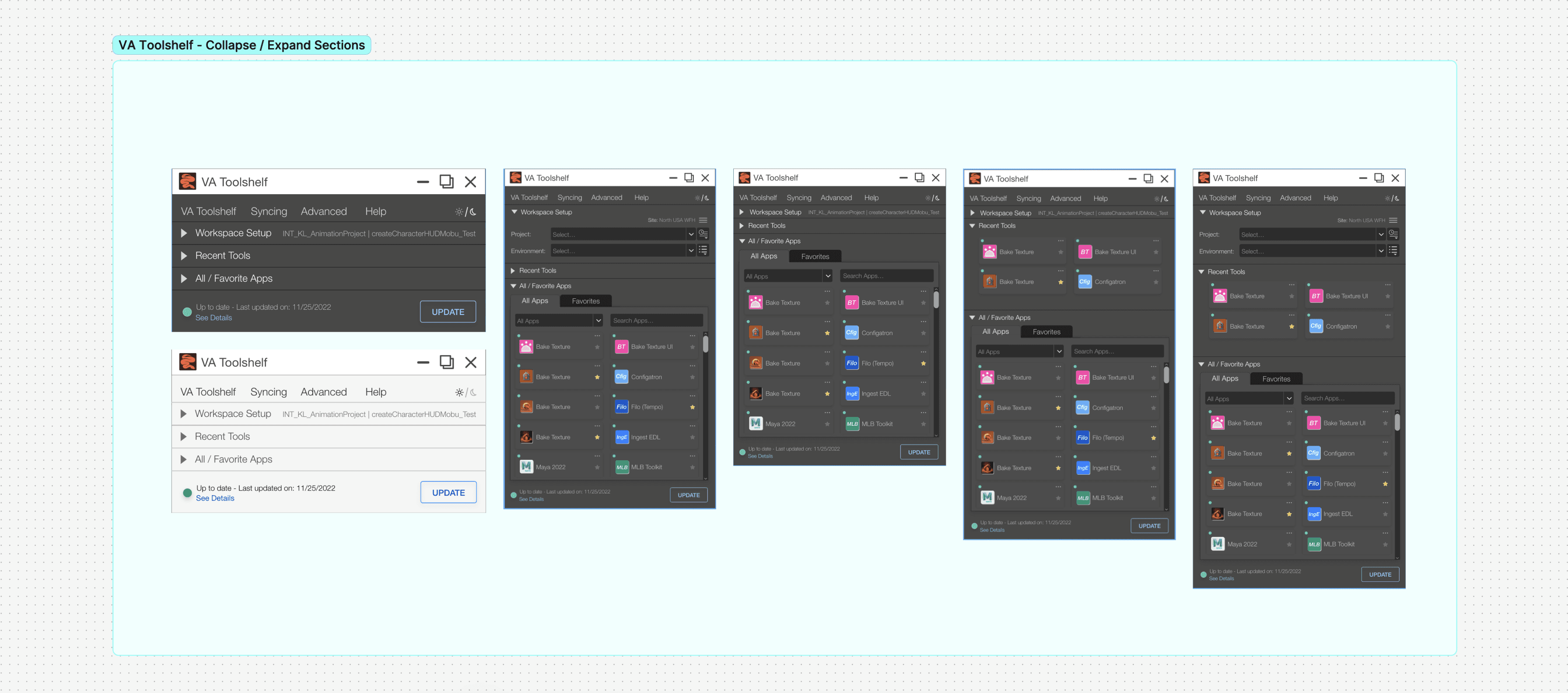
Liquid UI Architecture

  • A three-section, collapsible interface that adapts to multi-monitor workflows—shrinking when users are deep in production, expanding when planning

This was a direct response to observed real-world behavior, not theoretical layouts.

Validation & Outcomes:
Through iterative prototyping, usability testing, and beta rollout, success was measured using:

  • Adoption rate

  • Time-on-task

  • Successful task completion

Results:

  • Adoption increased from 60% → 90%

  • Onboarding time for new projects decreased

  • Artists regained trust in the platform and returned to their creative flow faster


Decision Tradeoffs


What Was Intentionally Simplified:

  • Standardized tool presentation patterns across departments to reduce cognitive load, even when it limited department-specific customization

  • Consolidated navigation and reduced visual noise to prioritize fast scanning and tool launch over dense information display

  • Streamlined notification and update messaging to focus on clarity and status rather than urgency or enforcement

What Was Postponed:

  • Highly granular permission and role-based customization that would increase maintenance and support complexity

  • Advanced personalization and recommendation logic that depended on broader data maturity and long-term analytics strategy

  • Automated, studio-wide enforcement mechanisms for updates that could disrupt active production work

What Was Not Built:

  • Feature-heavy dashboards that prioritized oversight over day-to-day usability

  • Aggressive, system-driven update enforcement patterns that would interrupt creative flow or penalize users visually

  • Custom workflows for every department that would fragment the experience and undermine platform cohesion

Design Stack

Design Stack

Design Stack

Design Principles That Guided the VA Toolshelf Redesign

Decision Tradeoffs


1. Protect Creative Flow Over System Enforcement:
Decisions prioritized minimizing interruptions to artists’ and developers’ workflows. Rather than enforcing compliance through disruptive UI patterns, the platform was redesigned to support creators in staying focused while still maintaining necessary system integrity.


2. Simplify Discovery Before Expanding Features:
Before introducing new functionality, the focus was on reducing cognitive load and improving tool discoverability. Navigation, filtering, and visual hierarchy were treated as foundational problems to solve prior to adding advanced capabilities.


3. Design for Autonomy With Guardrails:
Where possible, control was shifted from the system to the user. Features such as user-controlled update scheduling were designed to provide autonomy while still supporting production safety, technical validation, and studio requirements.


4. Optimize for Production Reality, Not Idealized Workflows:
Design decisions were grounded in real studio behavior, multi-monitor setups, overlapping tools, and time-sensitive production deadlines, ensuring the platform could survive high-pressure environments without becoming a distraction.


5. Validate Continuously With Engineering and Users:
Design feasibility, usability, and viability were evaluated in parallel through constant collaboration with the lead engineer and iterative testing with users. This reduced risk, accelerated iteration, and ensured solutions were production-ready.

What Was Intentionally Simplified:

  • Standardized tool presentation patterns across departments to reduce cognitive load, even when it limited department-specific customization

  • Consolidated navigation and reduced visual noise to prioritize fast scanning and tool launch over dense information display

  • Streamlined notification and update messaging to focus on clarity and status rather than urgency or enforcement

What Was Postponed:

  • Highly granular permission and role-based customization that would increase maintenance and support complexity

  • Advanced personalization and recommendation logic that depended on broader data maturity and long-term analytics strategy

  • Automated, studio-wide enforcement mechanisms for updates that could disrupt active production work

What Was Not Built:

  • Feature-heavy dashboards that prioritized oversight over day-to-day usability

  • Aggressive, system-driven update enforcement patterns that would interrupt creative flow or penalize users visually

  • Custom workflows for every department that would fragment the experience and undermine platform cohesion

Design Principles That Guided the VA Toolshelf Redesign


1. Protect Creative Flow Over System Enforcement:
Decisions prioritized minimizing interruptions to artists’ and developers’ workflows. Rather than enforcing compliance through disruptive UI patterns, the platform was redesigned to support creators in staying focused while still maintaining necessary system integrity.


2. Simplify Discovery Before Expanding Features:
Before introducing new functionality, the focus was on reducing cognitive load and improving tool discoverability. Navigation, filtering, and visual hierarchy were treated as foundational problems to solve prior to adding advanced capabilities.


3. Design for Autonomy With Guardrails:
Where possible, control was shifted from the system to the user. Features such as user-controlled update scheduling were designed to provide autonomy while still supporting production safety, technical validation, and studio requirements.


4. Optimize for Production Reality, Not Idealized Workflows:
Design decisions were grounded in real studio behavior, multi-monitor setups, overlapping tools, and time-sensitive production deadlines, ensuring the platform could survive high-pressure environments without becoming a distraction.


5. Validate Continuously With Engineering and Users:
Design feasibility, usability, and viability were evaluated in parallel through constant collaboration with the lead engineer and iterative testing with users. This reduced risk, accelerated iteration, and ensured solutions were production-ready.

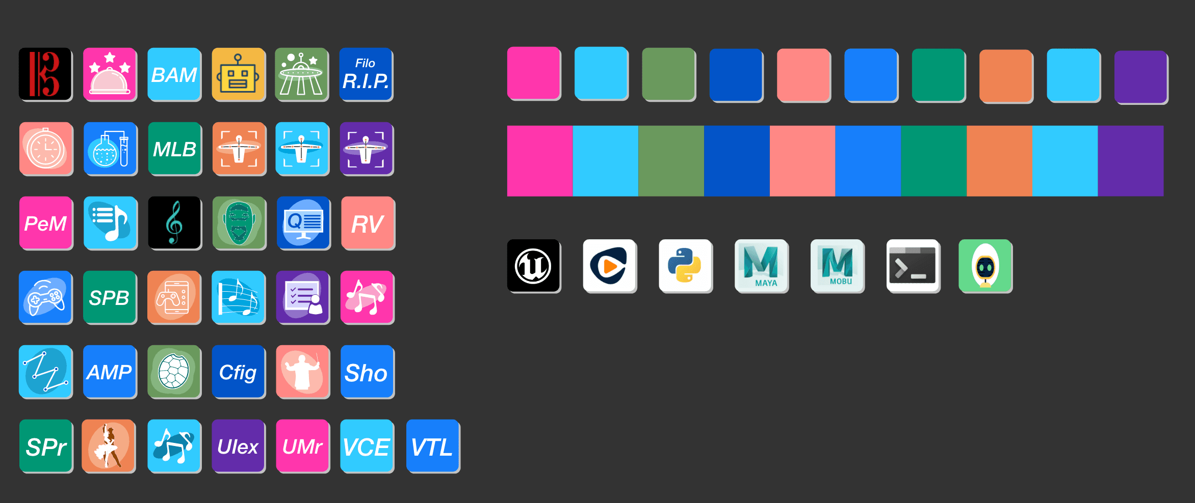
Designing Logos for Tools & Discoverability

Designing intuitive and cohesive icons for internal tools was a critical part of enhancing usability and visual hierarchy within the Toolshelf. Many tools lacked clear identity, which made it harder for users to scan and launch what they needed quickly amidst dense workflows. I developed a unified icon system for 37 tools by establishing a consistent visual language, considering form simplicity, color harmony, contrast, and scalability, so that each tool would be instantly recognizable without visual conflict when grouped together. This work not only improved discoverability but also supported a more cohesive and professional creator environment.

Lessons Learned

This project reinforced that great design is only the visible surface of the work. The real impact comes from deep collaboration, shared ownership, and designing systems that respect the people using them—especially in high-pressure, creative environments.

“Merilly hit the ground running, making a huge impact almost immediately on our team by establishing UX processes and style guides which contributed to more cohesive, polished and successful products. She is a champion for users and her support has helped to dig deep on user desires and issues that have not come up in general meetings and conversations.”

Rebecca Abel

Senior Software Engineer | PlayStation